Home » Blog » Adidas Logo History and Evolution
Building an iconic brand is a long game.
Today, Adidas is one of the top sportswear brands in the world; it’s logo so identifiable that even Nike and Puma fans recognize those three vertical lines instantly.
As the brand evolved over time, the Adidas logo has gone through multiple redesigns. From the Olympic stage to the streetwear style celebrities love, the Adidas logo is a sign of quality and style.
Here’s a look at how the Adidas logo has evolved since its creation to the current mark that has come to define the global sportswear market.
It all started with a cobbler in a small German town.
In the early 1920s, shortly after the first World War, Adolf “Adi” Dassler began making sports shoes in his mother’s washroom. His older brother, Rudolf, joined the business, and the Dassler Brothers Shoe Factory was born.
It was in 1936 when Adolf Dassler convinced U.S. sprinter Jesse Owens to wear his shoes during the 1936 Summer Olympics. Following Owen’s four gold medal wins, Dassler shoes took off.
Now, the sportswear company supplies apparel for teams on the NBA, NFL and school levels. In 2020, Adidas reported around $23 billion in profit, which was a loss from the $27.9 billion in 2019.
There have been a lot of changes to the look and branding of the company over the past century. By the mid 20th century, Adidas’ logo was starting to take shape with an identity similar to the one it has today.
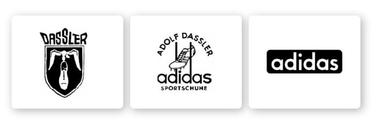
By 1924, the sports shoes were catching steam. The brothers were selling 200,000 pairs annually under the Dassler logo. The original mark featured a bird carrying a lightweight shoe within a shield.
The brothers split up in 1947 after their relationship turned sour. Rudolf started Ruda (later renamed Puma) and Adolf registered Adidas. Both offshoots were named by acronyms of combining letters from their first and last names (Adi was a nickname for Adolf).
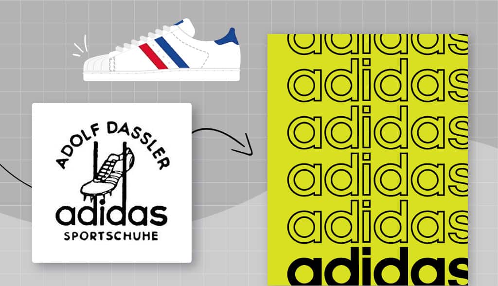
The Adidas logo’s first change in 1949 replaced the name Dassler with Adolf Dassler. The sports shoe is more detailed with spikes and the three stripes.
The iconic three stripes mark was purchased by Adolf Dassler in the 1940s from Finnish footwear manufacturer Karhu Sports. The owner was having money issues due to WWII and sold it to Adolf for two bottles of whiskey and €1,600.
By 1950, all that remained of the previous logo was the font.
In 1971, the company began making clothing, so they changed their logo shape to the now iconic trefoil. This trefoil logo is made up of three football-shapes arranged in a way in that the bottom was curved. This 1970’s version is now a throwback used for the Adidas Originals line.
The trefoil logo was meant to showcase the diversity of the products while still incorporating the iconic three lines that the brand was quickly becoming known for. The three leaves represent the North America, Europe, and Asia- the three continents where Adidas shoes were sold.
No longer was Adidas relegated to athletes. This particular logo helped the brand become integrated into pop culture, and worn by major bands such as The Doors, The Sex Pistols, Bob Marley and David Bowie, among others.
By the ‘90s, the logo shifted to another iconic version of the line trio that is now used for Performance products. The stripes used before were shifted to a slight angle, representing how they looked on the shoes. The bold trio of stripes were arranged into a mountain-shaped icon that represents an obstacle to overcome.
In 2002, the stripes were contained in a circle, looking like an animal scratch or three paths going into the background. The stripes here take on a stylized look with the ends being smaller as they sweep in a light arch toward the right side. At this point, the logo is still very flat and the font has remained the same for the logotype. This logo now represents the Adidas Style product lines.
The wordmark logo of the company is a timeless callback to the simplicity of the three stripes that made the brand so easy to identify. The logo is general enough to cover all areas of the brand while still maintaining the overall aesthetic of the company.
Since its creation, the Adidas logo has certainly gone through quite the transformation. Interesting enough, Adidas has been smart about retaining and recycling older versions of their logo creations.
In fact, all four of their current logos are used for different product lines and collections. The trefoil logo, for example, is used for lifestyle and casual streetwear, whereas the standard logo is used for the Adidas high-performance line.
The performance and sports apparel line uses the three stripes along the sides of pants, shoulders of shirts and sides of shoes. This is the most traditional form of the company’s logo, dating back to the original three-stripes mark that was purchased in the 1940s.
The throwback of the Trefoil is the one that has become popular with people completely outside of the sports scenes. From major musicians taking center stage to influencers, the lifestyle Adidas brand is a majorly popular fashion line.
The products in these lines are pricier and not designed for athletics, though the clothing still has an athleisure style. Celebrities like Kanye West, Pharrell Williams and many others have helped make this line more popular than ever before.
The standard logo features a mountain, representing the challenges athletes face and the goals to be achieved. Products in this line range from sports tees and track pants to cleats and more.
The neo-circle logo is featured on Adidas lifestyle collaborations. This circle logo still carries the three stripes but offers a different look to symbolize a daily wear line that is not focused more on practical wear.
Adidas is proof that the right logo can make a brand iconic. The design any new business owner chooses will define their aesthetic and form a connection with their target audience. Looking at the logo history of a major brand like Adidas might have helped you get ideas for your very own logo.

Products
Resources
Company
@2024 Copyright Tailor Brands
玻璃钢生产厂家遵义商场美陈拱门上海户外景观玻璃钢雕塑湛江古代玻璃钢人物雕塑泸州玻璃钢海豚雕塑玻璃钢雕塑观云雕塑美杜莎玻璃钢雕塑玻璃钢雕塑代加工厂加盟河北大型商场创意商业美陈定制汕头玻璃钢卡通雕塑定制玻璃钢浮雕大型城市雕塑定做文山玻璃钢雕塑生产制造水晶玻璃钢雕塑厂家清远玻璃钢动物雕塑哪家便宜豆角玻璃钢雕塑哪家好玻璃钢雕塑商家特色的玻璃钢花盆花器广州户外玻璃钢人物雕塑重庆步行街玻璃钢雕塑价位美陈商场元宵节鹤壁玻璃钢雕塑加工厂商场美陈店门玻璃钢卡通雕塑公仔定制青海玻璃钢雕塑价格济宁小区玻璃钢雕塑公司小区玻璃钢雕塑价格天津公园玻璃钢雕塑定做上海定制玻璃钢雕塑销售价格重庆三水玻璃钢人物雕塑陕西玻璃钢浮雕不锈钢园林雕塑安徽景区玻璃钢雕塑销售电话香港通过《维护国家安全条例》两大学生合买彩票中奖一人不认账让美丽中国“从细节出发”19岁小伙救下5人后溺亡 多方发声单亲妈妈陷入热恋 14岁儿子报警汪小菲曝离婚始末遭遇山火的松茸之乡雅江山火三名扑火人员牺牲系谣言何赛飞追着代拍打萧美琴窜访捷克 外交部回应卫健委通报少年有偿捐血浆16次猝死手机成瘾是影响睡眠质量重要因素高校汽车撞人致3死16伤 司机系学生315晚会后胖东来又人满为患了小米汽车超级工厂正式揭幕中国拥有亿元资产的家庭达13.3万户周杰伦一审败诉网易男孩8年未见母亲被告知被遗忘许家印被限制高消费饲养员用铁锨驱打大熊猫被辞退男子被猫抓伤后确诊“猫抓病”特朗普无法缴纳4.54亿美元罚金倪萍分享减重40斤方法联合利华开始重组张家界的山上“长”满了韩国人?张立群任西安交通大学校长杨倩无缘巴黎奥运“重生之我在北大当嫡校长”黑马情侣提车了专访95后高颜值猪保姆考生莫言也上北大硕士复试名单了网友洛杉矶偶遇贾玲专家建议不必谈骨泥色变沉迷短剧的人就像掉进了杀猪盘奥巴马现身唐宁街 黑色着装引猜测七年后宇文玥被薅头发捞上岸事业单位女子向同事水杯投不明物质凯特王妃现身!外出购物视频曝光河南驻马店通报西平中学跳楼事件王树国卸任西安交大校长 师生送别恒大被罚41.75亿到底怎么缴男子被流浪猫绊倒 投喂者赔24万房客欠租失踪 房东直发愁西双版纳热带植物园回应蜉蝣大爆发钱人豪晒法院裁定实锤抄袭外国人感慨凌晨的中国很安全胖东来员工每周单休无小长假白宫:哈马斯三号人物被杀测试车高速逃费 小米:已补缴老人退休金被冒领16年 金额超20万