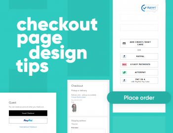

Going through the checkout page of your eCommerce store is the final step customers need to take to start generating sales. There is no question that this is the most important part of the shopping experience.
Today we wanted to bring a couple of examples of eCommerce checkout pages that are fast and easy to use.
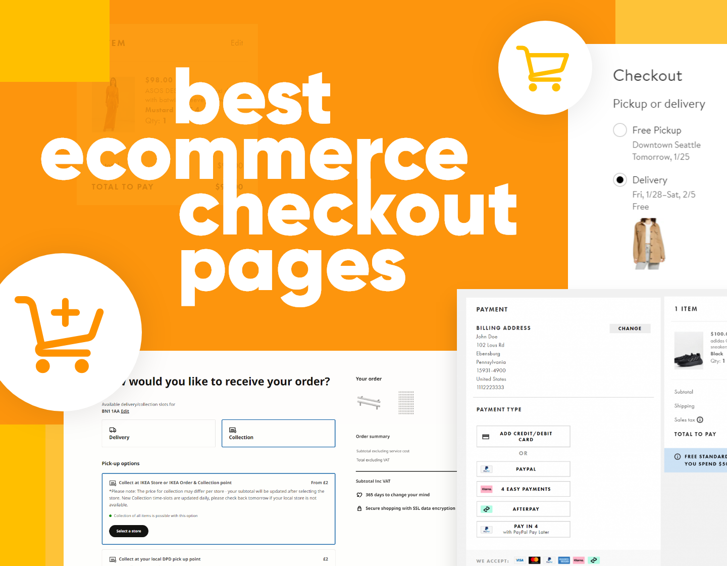
The common features all great eCommerce checkout pages have
While taking a look at these examples of eCommerce checkout pages we want you to keep in mind these features.
- A fast checkout process with as few steps as possible
- Checkout pages that are optimized for mobile screens
- No distractions on the checkout page itself
- Graphical elements (badges, icons) to reassure the user of the security of the checkout process
- Multiple payment methods.
These are all very important features that contribute to higher sales, lower abandonment rates, and a good user experience.
1. Fashion Nova – a fast one-page checkout in 3 simple steps
Fashion Nova is one of the biggest clothing stores in the US. Despite the fact that it’s relatively new (at least compared to competitors like Zara, Forever 21, and Uniqlo) it has quickly grown to be one of the most recognizable fashion brands.
With that in mind, let’s take at the checkout process through which thousands of customers go every day.
The eCommerce checkout process of Fashion Nova consists of 3 easy steps that all take place on a single page.
1. First, you need to fill out your address and contact information. The website does a great job of guessing your address after you enter a few words. This is a great quality of life feature.
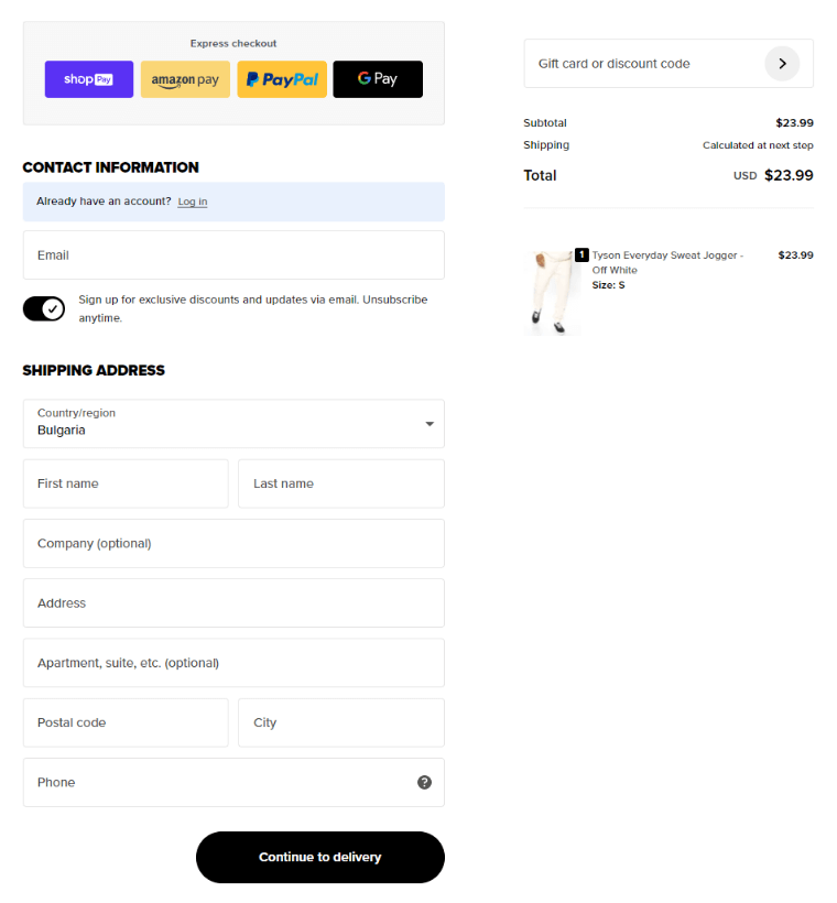
2. Then you have to select your delivery method. You have 3 options to choose from. The difference between the 3 is the price and time it will take to ship your items.
3. Finally, you are presented with a form to fill out your payment information. You can also save your payment information for future purchases which is a nice bonus feature.
We really enjoyed the speed and convenience of this eCommerce checkout page. During the entire process, we weren’t asked to register or go through any account creation steps which is always a welcome feature.
2. Nordstrom – a checkout experience that requires almost no action from the customer.
Nordstrom is a US-based clothing and accessories retailer. It offers clothing items from some of the most recognizable brands. If you are looking to buy clothing-related items you are sure to find something since the store has one of the biggest inventories.
Nordstrom’s checkout page is a great example of requiring as little information from the customer as possible.
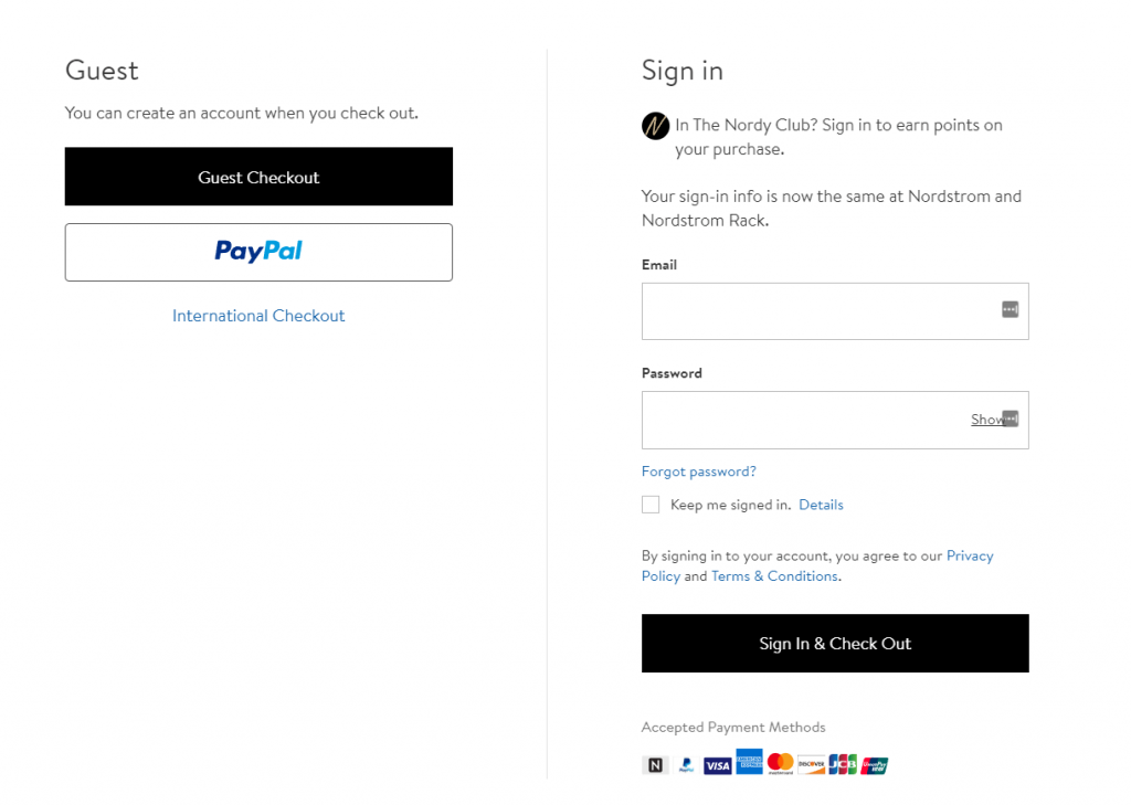
1. When you start the checkout process at Nordstrom you are first presented with a choice of creating an account or ordering as a guest. We really appreciate the fact that Nordstrom doesn’t hide its guest checkout option. For this example, we selected the Guest checkout option.
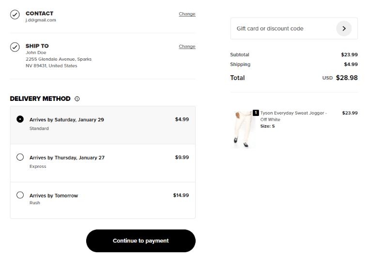
2. After that, you are presented with a one-page checkout that gives you the choice of in-store pickup or delivery. This is a great feature for buyers who prefer to go to the store and immediately try out their items on pickup. If you want to have the items delivered can automatically have the website guess your address.
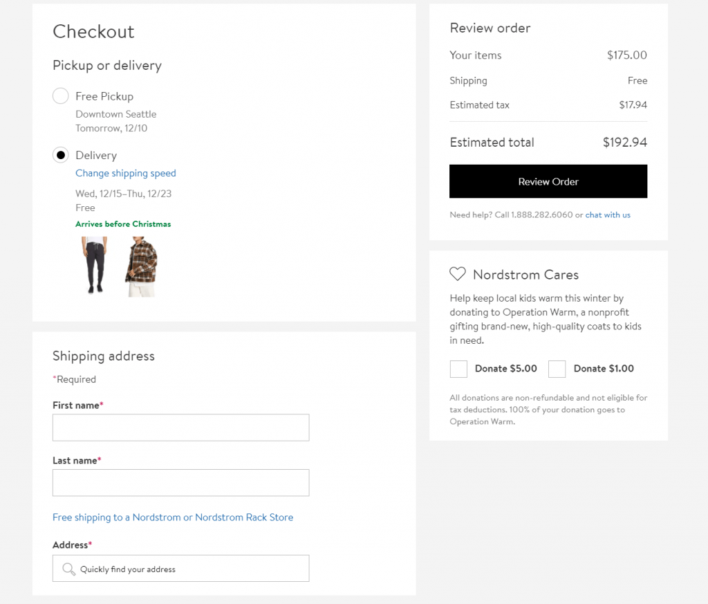
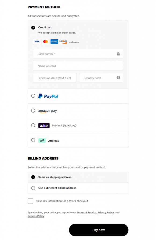
3. In the final step of the checkout process, you just need to fill out a phone, email payment info, and you’re done.
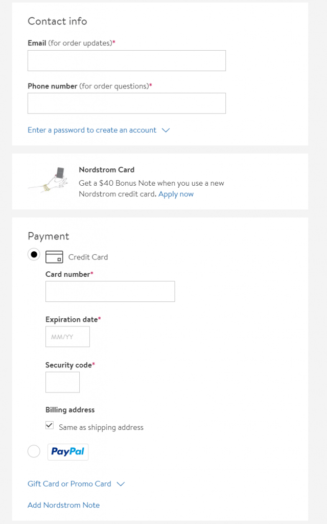
Considering that we’ve filled out email subscription forms that ask for more information we really enjoyed how quickly and easily we were able to fill out the checkout page of Nordstrom.
3. Bellroy – how to fit an entire checkout page above the fold.
Bellroy is a US company that produces a wide variety of wallets, bags, and holders. The company skyrocketed to the top by focusing on the quality and simplistic design of its products. They were one of the fashion brands that took the startup mentality to the fashion industry.
So let’s see what kind of innovation and forward-thinking Bellroy brings to the checkout experience.
With clever layout and design, Bellroy has managed an entire checkout process above the fold of their webpage. Their checkout page is neatly organized in 3 columns.
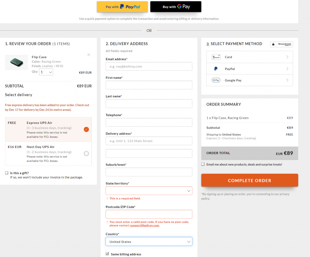
1. In the first column, you have your item showcased and you have a choice between delivery methods. This is an interesting position choice since almost all other eCommerce stores decide to place the products on the right.
2. In the second column, you fill out your usual information. That is pretty much the only place where you really have to fill out any data.
3. Finally, you select your payment method and you’re done.
This eCommerce checkout page is a great example of how a good layout can fit a lot of items in a small space without feeling convoluted.
4. IKEA – keeping it simple and easy even additional steps are necessary.
IKEA really doesn’t need a company introduction. Being one of the biggest companies in the world, its signature affordable products can be found in almost any modern home.
Just like their furniture, their eCommerce checkout page is very simple despite having a few extra steps.
You should use IKEA’s page as an inspiration that even when the process of online shopping has its intricacies you should still try to keep things simple and fast.
1. Unlike most checkouts, you start by entering your zip code. This is an important step for the next steps.
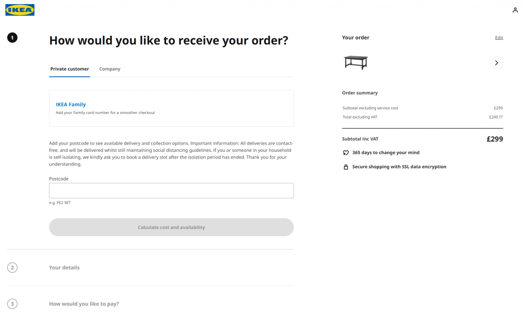
2. After you’ve entered your zip code you are presented with a lot of options as to how you want your item delivered. You can select between delivery and pickup options. Since IKEA is a global chain with multiple physical locations with different inventory the zip code you entered previously is used to verify the availability of your desired items.
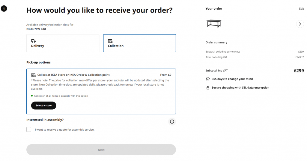
3. Since IKEA furniture requires assembly you also have the option to request a quote for assembly service. Depending on the number and complexity of the items in your cart you will get a corresponding price.
4. For the next few steps, you just enter payment and address information (if you chose delivery) and you’re good to go.
IKEA proves that you should always strive to have a simple and fast checkout page even if your checkout process has additional steps. Despite the extra steps that the customer needs to take we think this is still an awesome example of an eCommerce checkout page.
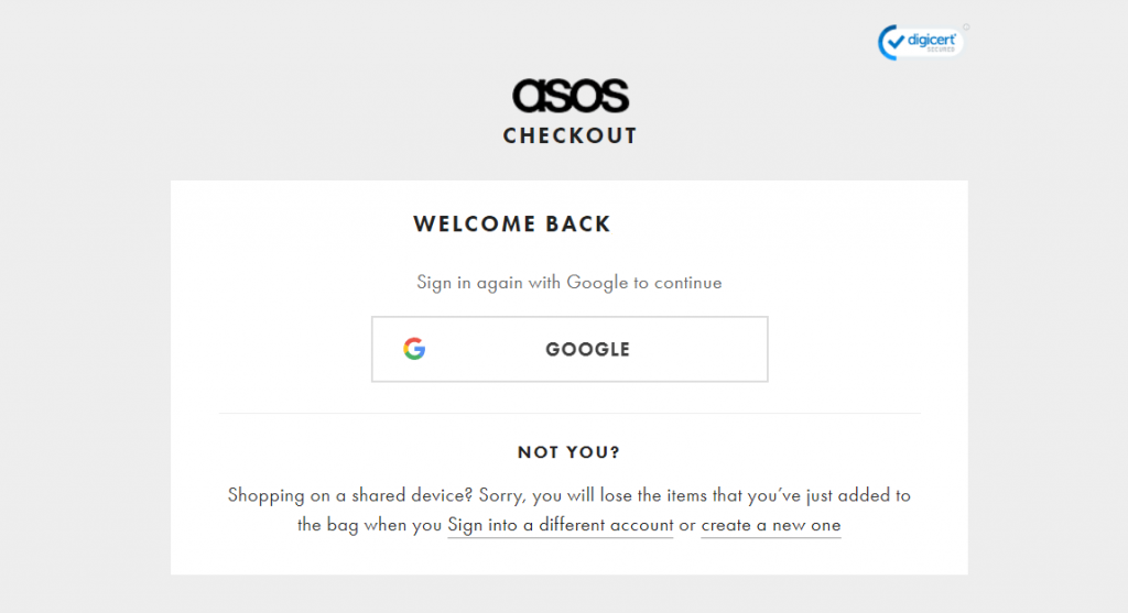
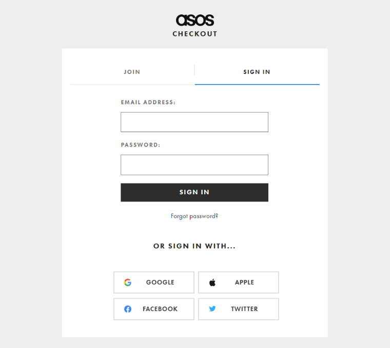
5. ASOS – making repeat purchases is the main focus of the shopping experience.
If you’ve ever gone online and searched for clothing then you’ve probably come across ASOS. It’s one of the biggest online clothing retailers in the world with almost every brand and every price point on offer.
What’s interesting about their eCommerce checkout page experience is the focus on making sure customers come back to buy again. This decision makes their checkout experience slightly different.
1. At the start of the eCommerce checkout page, you will be required to create an account. Unlike most other online retailers ASOS doesn’t offer a guest checkout option. The reason for that is they bet on making customers do a little bit more work for their first purchase but be able to order items in a single click after that.
2. After you create your account you will be taken to a more traditional checkout page. What you will notice here is that all of your info is already filled out meaning that the next time you return to buy you don’t have to fill out anything.
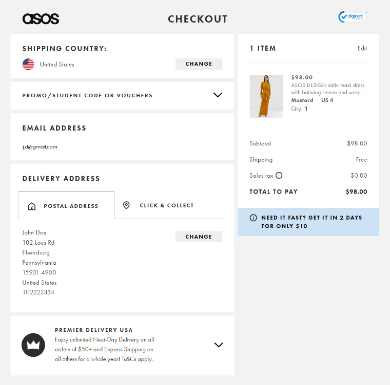
3. Finally, you just need to select your payment method and that’s really it.
It is interesting to see how this focus on a long-term relationship with the customer slightly changes up the eCommerce checkout experience. If your store is also in the market for the long term take inspiration from ASOS.
6. Amazon – we simply can’t talk about eCommerce without mentioning it.
We can’t really talk about eCommerce without mentioning the biggest eCommerce store in the world. We won’t focus on their checkout process in this article since nowadays it’s become less innovative and more of a staple for every online shop.
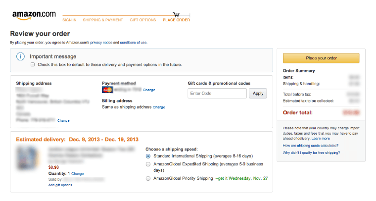
It is noteworthy to mention that Amazon was the first to do a lot of things we now consider mandatory like:
- The idea of reducing the overall number of clicks needed to purchase an item
- Saving users information for future purchases
- Streamlining the information they need to fill out
- Providing multiple payment methods
- Providing multiple delivery options
This is why it’s always a good idea to keep an eye on how they do things. While some options they’ve added like same-day delivery are impossible to implement due to costs and logistics it’s always a good idea to look at what the big companies are doing.
Final Words
By now you should have a good idea of how some of the biggest and best eCommerce stores handle their checkout pages. By keeping in mind the principles of simple and fast checkout pages you are sure to increase your sales and leave your customers happy.