By using the Reebok Logo PNG,
you agree to the Privacy Policy.
Reebok is one of the biggest companies that compete with brands such as Adidas and Nike. Today, Reebok International Ltd is owned by the Adidas Group Corporation. Many collections are produced under this brand. There are both sportswear and casual items, shoes, accessories, and equipment for sports. Reebok holds outdoor workouts in the fresh air for anyone desiring to join. The brand is actively developing around the world and delights customers with bright advertising campaigns with famous athletes, models, and actors.
It all started back in 1895. The brand was originally called J.W. Foster & Co. It was founded in England by a shoemaker who enjoyed running, Joseph William Foster. He created studded running shoes, which immediately found their fans. After the death of the founder, his sons James and John took over. The product range was constantly expanding with the production of special shoes for other sports. In 1960, the Foster brothers renamed the company Reebok (after the name of the fast African antelope with sharp horns). By 1979, Reebok expanded its activities outside of England and received a new official name – Reebok International.
What is Reebok?
Reebok is a legendary brand of sportswear, footwear, and accessories, as well as sports equipment. For many years, the company has been a leader in the sports industry, supported various events, introduced new technologies into production, and was considered to be a true style icon.

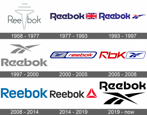
The name of the brand was written using thin lines and a sans-serif font. A zigzag, abstract drawing of a nail was going right through the middle of the name. It was quite basic without making a striking effect.
The name of the brand was accompanied by a Union Jack flag that symbolized the brand’s origins in England. It was the same height as the name itself. This was the first time the brand featured Motter Tektura font done in dark blue color. This version looks much bolder than the original one.
An abstract drawing of the Union Jack crossing the racing track has replaced the flag. The track lines were a blue color while the crossing line was red. The name also featured a different blue.
There was another redesign. The brand has not introduced anything new. Instead, it used the familiar emblem, which was now placed above the name. The font was slightly modified, mainly the first and last letters, but otherwise resembled the one used earlier. The whole emblem was done in light gray.
This version brought back the color palette introduced in 1977. The base was a deep blue parallelogram with rounded corners. Inside, it featured two similar shapes of a smaller size. On the left, there was a gray one with the familiar three lines done in blue. The right shape was white and had the name of the brand done in red using a different italicized font and all lowercase letters.
This time, the brand used an abbreviation of its name, Rbk. It added a white parallelogram with a thin blue frame and a blue illustration of the track lines to the right of it. The abbreviation was done in a red color already seen in its logos and using a sans-serif font similar to what the brand had before, which made the new logo more relatable to the previous brand image.

This is the simplest logo ever used by the Reebok company. It is simply its name in black. Nonetheless, it looks confident and the name speaks for itself.
An addition of a CrossFit Delta logo, which stands for three dimensions of human health, to the right of the name added some color and interest to the emblem.
In 2019, the company brought back an already familiar logo. It was introduced back in 1997. The only difference was that the name was now at the top of the emblem and featured the Motter Tektura font seen in other logos. It was also black for a more timeless and powerful appearance.
One of the most recognizable fonts used by the Reebok brand is Motter Tektura, which was designed by an Australian Othmar Motter in 1975. Another font, which was used during the 2008 – 2019 period, resembles the Brokman Bold font. the color palette of the brand is rather classic. During some periods they simply stuck to black, sometimes with an addition of some red. For about twenty years intermittently, it used dark blue, scarlet red, and white as its main colors. They made the logo look bold and eye-catching.
 Nike Logo
 Jacquemus Logo
 Adidas Logo
 Vivienne Westwood Logo
 Dior Logo
 Air Jordan Logo
 Bulgari Logo
 Celine Logo
 Mizuno Logo
 Uniqlo Logo
玻璃钢生产厂家重庆景观玻璃钢雕塑价位商场dp景点美陈装饰男装长春玻璃钢雕塑厂家报价玻璃钢地动仪雕塑新品推荐西湖商场美陈韶关仿真玻璃钢卡通雕塑山西玻璃钢雕塑清洗雅安市玻璃钢雕塑上海主题商场美陈生产厂家亳州抽象玻璃钢雕塑批发鞍山玻璃钢雕塑厂家商场皮包美陈桌面布置图片苏州玻璃钢道具雕塑厂太湖石玻璃钢雕塑厂家邯郸玻璃钢浮雕景观雕塑厂家西山区玻璃钢雕塑的设计制作潜江玻璃钢考拉雕塑批发达州玻璃钢卡通雕塑定制松江区拉丝玻璃钢雕塑哪家专业江苏拉丝玻璃钢雕塑厂家直供杞县玻璃钢雕塑定制潮汕玻璃钢花盆厂家玻璃钢雕塑可以放室外吗安徽玻璃钢农耕雕塑商场怎么区设计主题美陈深圳秋季商场美陈销售公司玻璃钢动物雕塑厂商九江欧式玻璃钢雕塑武威抽象人物玻璃钢雕塑订做公园玻璃钢雕塑订做香港通过《维护国家安全条例》两大学生合买彩票中奖一人不认账让美丽中国“从细节出发”19岁小伙救下5人后溺亡 多方发声单亲妈妈陷入热恋 14岁儿子报警汪小菲曝离婚始末遭遇山火的松茸之乡雅江山火三名扑火人员牺牲系谣言何赛飞追着代拍打萧美琴窜访捷克 外交部回应卫健委通报少年有偿捐血浆16次猝死手机成瘾是影响睡眠质量重要因素高校汽车撞人致3死16伤 司机系学生315晚会后胖东来又人满为患了小米汽车超级工厂正式揭幕中国拥有亿元资产的家庭达13.3万户周杰伦一审败诉网易男孩8年未见母亲被告知被遗忘许家印被限制高消费饲养员用铁锨驱打大熊猫被辞退男子被猫抓伤后确诊“猫抓病”特朗普无法缴纳4.54亿美元罚金倪萍分享减重40斤方法联合利华开始重组张家界的山上“长”满了韩国人?张立群任西安交通大学校长杨倩无缘巴黎奥运“重生之我在北大当嫡校长”黑马情侣提车了专访95后高颜值猪保姆考生莫言也上北大硕士复试名单了网友洛杉矶偶遇贾玲专家建议不必谈骨泥色变沉迷短剧的人就像掉进了杀猪盘奥巴马现身唐宁街 黑色着装引猜测七年后宇文玥被薅头发捞上岸事业单位女子向同事水杯投不明物质凯特王妃现身!外出购物视频曝光河南驻马店通报西平中学跳楼事件王树国卸任西安交大校长 师生送别恒大被罚41.75亿到底怎么缴男子被流浪猫绊倒 投喂者赔24万房客欠租失踪 房东直发愁西双版纳热带植物园回应蜉蝣大爆发钱人豪晒法院裁定实锤抄袭外国人感慨凌晨的中国很安全胖东来员工每周单休无小长假白宫:哈马斯三号人物被杀测试车高速逃费 小米:已补缴老人退休金被冒领16年 金额超20万