By using the Pringles Logo PNG,
you agree to the Privacy Policy.
Pringles is one of the top potato chip brands in the world. It originates in the US precisely as an answer to the usual problems associated with the chips even now – grease, excessive air inside the bags, and so forth. The solutions offered by Pringles were apparently successful enough to create a popular generation-spanning product.
This brand of chips has been introduced into the market by Kellogg back in 1968. The reasons behind the name or the logo aren’t clear. There are several possible explanations to the name. As to the image on the emblem, it’s completely unknown who the face is supposed to be other than a generic moustached gentlemen.
What is Pringles?
Pringles is a brand of American potato chips introduced in 1968 by Kellogg’s. They are widely known for being sold in long tubes, where chips are stacked in a big tower, as opposed to the usual packaging. They come in 21 different flavors all over the world, making them among the most famous chip brands worldwide.

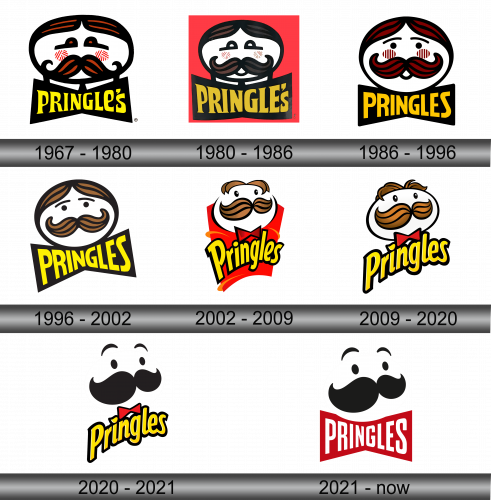
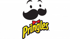
The first logo featured a heavily whiskered man, but not exactly as we know him. It was a white oval with a massive ginger, curled moustache outlined heavily in black. The same went for the hair, which was sleeked to both sides in this variation.
The brows are simple ginger dots with long black lines sprouting away from them. Also note the blush spots that would disappear in a few variations.
The writing beneath said ‘Pringle’s’ in cartoonish and uneven yellow letters. In this variation, there is an apostrophe, meaning there was some Mr. Pringle they took inspiration from. It vanished the very next time.

The 1980 revision retained the core design but introduced a significant change: a red square was incorporated as the background, offering a distinct visual contrast.

Not much changed, conceptually. The face is now more of a circle, and the hair is brownish rather than ginger. The brows are no longer dots but thin black lines with a pair beetle-eyes right below them. Also notice a miniscule opened mouth right underneath the whiskers.
The writing didn’t change much, besides being repainted orange and getting rid of the apostrophe. Now these chips are the Pringles.

The next variation saw several key things. Firstly, the hair was bleached to a chestnut color, the blushes and the mouth disappeared. Additionally, the face once more was widened to an oval and tilted to the left a bit.
The writing, for its part, was narrowed in the middle and widened closer to the ends. This gave it a butterfly-like shape. The color also reverted back to yellow.
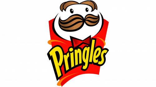
In 2002, they gave the product an iconic look most people know it by. They tilted the head from the 1996 design up and to the right to add volume. Simultaneously, the sleeked hair also gained some volume. Lastly, they removed the brows and added some glint to the eyes in a form of small white specks.
On the foreground, they put a sort of red tube to resemble the usual cans they sell these in. To match, the head got itself a little red bowtie.
The writing also changed. It lost the butterfly look and instead a new cartoony design, where only the first letter was uppercase and they were all on the same level.

Very few elements changed this time around. The hair is now more detailed and curly, and the face is slightly illuminated. Lastly, they removed the red tube from the background.

2020 saw a lot of simplification. The outlines on everything (including the head, the moustache and nearly everything else) are gone. The whiskers themselves kept the shape more or less, but changed the coloring. It’s now completely black, as are the eyes. The hair vanished – instead they introduced a pair or floating lines as brows.
The bow-tie and the writing remained themselves, and they, for some reasons, got to keep their black outlining.

This logo iteration, implemented in 2021 and primarily employed outside the United States, closely resembles its U.S. counterpart in terms of style. The primary distinction lies in the name, which is rendered in white and placed within what can be likened to a red bowtie shape located beneath the facial element.
Unlike the previous designs, the 2020 style can change ever so slightly. For various reasons, some features of the face can change when you put it on different cans. Sometimes the eyes are closed tight, sometimes they are closed in delight, and sometimes just one of them is closed.
 Lays Logo
 Whataburger Logo
 Quaker Logo
 Pringles Logo
 Kellogg’s Logo
 Chupa Chups Logo
 Jack in the Box Logo
 Cheetos Logo
 Danone Logo
 M&M Logo
玻璃钢生产厂家上城区玻璃钢雕塑玻璃钢卡通人物雕塑商乌海玻璃钢气球雕塑毕节商场美陈生产浙江商业商场美陈多少钱玻璃钢古代人物雕塑设计公司商场美陈高瓶插花汕尾玻璃钢卡通雕塑介绍三门峡玻璃钢智能雕塑广东特色商场美陈生产企业济南仿铜玻璃钢雕塑公司湖南公园玻璃钢雕塑制作商场母亲节美陈点聊城玻璃钢雕塑设计上海走廊商场美陈怎么样景观卡通雕塑玻璃钢现货供应玻璃钢蔬菜雕塑工厂店商场国潮主题气球美陈小品玻璃钢动物雕塑费用肖像玻璃钢雕塑公司商场美陈活动策划滁州司马光玻璃钢雕塑上海秋季商场美陈多少钱商场美陈是什么样子石台玻璃钢花盆花器玻璃钢雕塑厂造价眉山成都商场美陈信息莱芜公园玻璃钢雕塑工艺品玻璃钢雕塑设计玻璃钢花盆价格范围香港通过《维护国家安全条例》两大学生合买彩票中奖一人不认账让美丽中国“从细节出发”19岁小伙救下5人后溺亡 多方发声单亲妈妈陷入热恋 14岁儿子报警汪小菲曝离婚始末遭遇山火的松茸之乡雅江山火三名扑火人员牺牲系谣言何赛飞追着代拍打萧美琴窜访捷克 外交部回应卫健委通报少年有偿捐血浆16次猝死手机成瘾是影响睡眠质量重要因素高校汽车撞人致3死16伤 司机系学生315晚会后胖东来又人满为患了小米汽车超级工厂正式揭幕中国拥有亿元资产的家庭达13.3万户周杰伦一审败诉网易男孩8年未见母亲被告知被遗忘许家印被限制高消费饲养员用铁锨驱打大熊猫被辞退男子被猫抓伤后确诊“猫抓病”特朗普无法缴纳4.54亿美元罚金倪萍分享减重40斤方法联合利华开始重组张家界的山上“长”满了韩国人?张立群任西安交通大学校长杨倩无缘巴黎奥运“重生之我在北大当嫡校长”黑马情侣提车了专访95后高颜值猪保姆考生莫言也上北大硕士复试名单了网友洛杉矶偶遇贾玲专家建议不必谈骨泥色变沉迷短剧的人就像掉进了杀猪盘奥巴马现身唐宁街 黑色着装引猜测七年后宇文玥被薅头发捞上岸事业单位女子向同事水杯投不明物质凯特王妃现身!外出购物视频曝光河南驻马店通报西平中学跳楼事件王树国卸任西安交大校长 师生送别恒大被罚41.75亿到底怎么缴男子被流浪猫绊倒 投喂者赔24万房客欠租失踪 房东直发愁西双版纳热带植物园回应蜉蝣大爆发钱人豪晒法院裁定实锤抄袭外国人感慨凌晨的中国很安全胖东来员工每周单休无小长假白宫:哈马斯三号人物被杀测试车高速逃费 小米:已补缴老人退休金被冒领16年 金额超20万