Online shopping has become a norm nowadays, with more and more people ordering almost anything, from groceries and home decor to electronics and health supplements, via e-commerce shops.
However, if you are a WooCommerce store owner, then there is a big issue that you need to be concerned about.
Did you know?
Around 60-80% of the customers that reach the checkout page of your site end up abandoning the order.
That’s right. Out of every 100 prospects that are about to pay, 60-80 of them, for some reason, abandon the website without completing the order. And this is a serious matter.
Not only are you losing the chance to earn more revenue, but you are also losing on acquisition costs and other extra costs (such as hosting fees, subscription fees on plugins, etc.). So, how can you reduce this loss?
The best way to tackle this issue is to use a custom checkout page that is optimized to reduce abandonment and increase conversion.
You see, buyers may abandon your site for as little as having too many fields in the checkout form. In fact, the checkout page layout and the design may be partly responsible for unnecessary distractions that cause cart abandonment.
Today, you will learn how you can customize your WooCommmerce checkout page effectively so that a customer doesn’t get distracted and is rather keen to complete the order.
By the end of this article, you will learn several unique ways to optimize your checkout process for maximum conversion and grow your revenue.
So let’s begin.
Unique Ways To Customize Your WooCommerce Checkout Page For Maximum Conversions
When it comes to optimizing your checkout process, you will find several guides online that will give you advice, such as “avoid hidden costs,” “add more payment options,” and so on. While those are valid advice, here, we will focus on a few custom checkout page ideas that are more focused on making the checkout process distraction-free and enticing for the buyers to complete the orders.
These are ideas that can take your buyers’ experience site to the next level and help you increase the overall checkout page conversion rate.
Following are 5 unique ideas you can apply quite easily:
- Use A Custom Checkout Page Layout That’s Distraction-free
- Create A Simplified Checkout Experience By Optimizing The Form Fields
- Allow Customers To Purchase More Quantity On Checkout
- Maximize Coupon Impact For A Better Checkout Experience
- Make Interesting One-click Offers On The Checkout Page
Let us look at them in detail.
1. Use A Custom Checkout Page Layout That’s Distraction-free
Your traditional WooCommerce checkout page is pretty straightforward – a single form with all the fields placed one after one another while the order details are at the very bottom.
If you have a premium theme with WooCommerce customization, then it may give you the option to use a different checkout page design. But the default design is usually a single checkout form with a lot of fields to fill out for your buyers.
This can often act as a distraction as the buyer may feel they don’t have enough time to complete the form.
In other scenarios, if you include extra content on the page, such as product suggestions, testimonials, or Ads, it makes the checkout experience terrible for the buyer as now he has too many things to focus on.
You must try to make the checkout process as easy as possible, with the least form of distractions. You do not want to take the buyer’s mind away from the intention of paying.
Following are a few ways you can optimize this experience:
- Use A Custom Checkout Form With Mult-steps
By default, the buyer needs to look at a lot of fields for contact details, address, order details, shipping details, and so on, all at once. In this case, you may rather use a multi-step checkout layout. Seemingly, break down the checkout page into a 2, 3, or 4 steps process where the buyer has to input a single set of information at a time.
For example, a four-step checkout may be as follows:
– Step 1: Collect the buyer’s name, email & phone number.
– Step 2: Collect the billing address.
– Step 3: Choice of shipping options and confirm the shipping address.
– Step 4: Order summary and payment.
This approach will help the customer to focus on one detail at a time and avoid getting overwhelmed from the start.
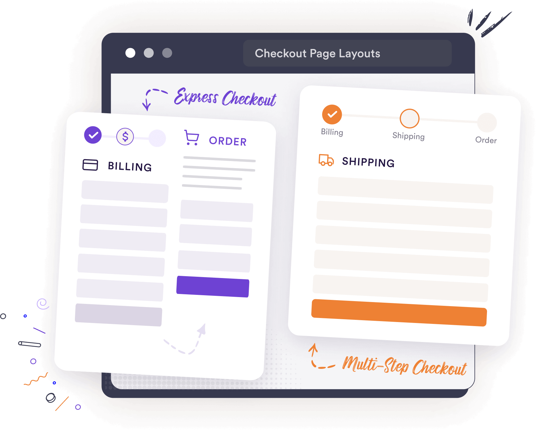
- Use A Custom Checkout Layout That Keeps The Buyer Focused On The Order
A unique checkout page layout that you can use is the Express Checkout Form. This is a custom checkout layout where the order summary is a sticky section on the right, while the customer’s data collection form is on the left in a 3-step process – Customer information, Billing & Shipping Address, and Shipping Options & Payment Details.
What this layout does is, it keeps the customer focused on what he is ordering while he goes through the step-by-step checkout form. Hence, he is less likely to change his mind and end up completing the order smoothly.
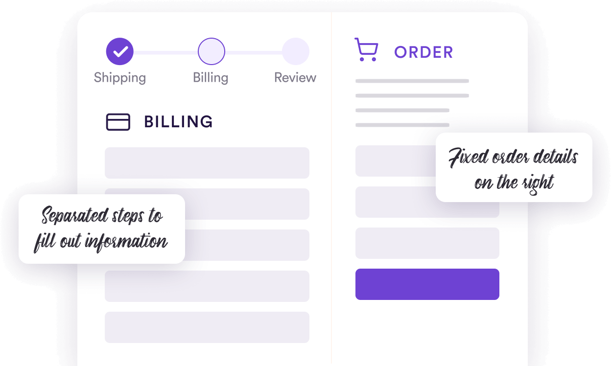
Here’s a guide on a few custom checkout page layouts that you may look at for further improvements.
- Allow Guest Checkout, Instant Login, & Instant Registration
Often buyers may find it annoying if you request them to register every time. Try using the option to allow guest checkout. This will allow non-logged-in users to place orders without getting annoyed with a prompt to log in when placing the order.
You may also consider enabling the option to register and log in, while placing the order, without taking them to a separate window. This will significantly reduce the chance of losing buyers due to unwanted interruptions.
2. Create A Simplified Checkout Experience By Optimizing The Form Fields
Another key area to focus on is optimizing the checkout form fields.
Having a dull checkout form design, with unnecessary fields can be overwhelming for some buyers. People would very much appreciate it if you worked on your checkout page to make it more simplified and soothing to the eye.
So, here’s what you can do.
- Reduce the number of fields where possible. For example, instead of separating the “First Name” and “Last Name” fields, consider using a single “Full Name” field.
- Only ask for the necessary information to complete their purchase. For example, if you sell digital products, then no need to collect the billing & shipping addresses.
- Add necessary fields when required. For example, if you sell in the EU region, you must include a field to collect the Tax number.
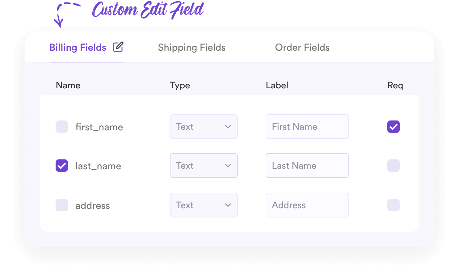
- Use an address autocomplete feature so that most part of the address can be auto-filled upon choosing the country or when typing in the zip/postal code.
- Customize section headings to make them more meaningful and personalized for the buyer. For example, instead of using “Billing Details,” use “Your Billing Address.”
- You may customize the field border colors and text font to make it more soothing to the eye.
Overall, it will help save your buyers time and make the process easier to go through.
3. Allow Customers To Purchase More Quantity During Checkout
One small flaw that WooCommerce has is that buyers cannot change the product quantity on the checkout page.
Let’s say a buyer is on the checkout page to order a t-shirt. But now, he decided that he rather wants to buy 2 t-shirts instead. To do this, he now has to go back to the cart, update the quantity, and then come back to the checkout page again. This is quite annoying, especially if the customer is using a mobile.
Most buyers in such situations will rather settle for what they have already added instead of going back and forth because they do not want to spend time with these extra steps.
This is a very small missing element that can make you lose the chance to make some extra money from potential buyers.
The solution to this is small customization that will allow buyers to change product quantities right on the checkout page.
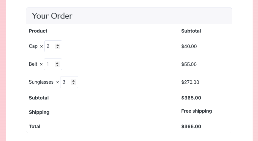
This seems like a minor reason, but you will be surprised when you will see higher results just by implementing this small change.
4. Maximize The Use Of Coupons For A Better Checkout Experience
When running a coupon campaign, you would expect people to be determined to complete the purchase just to get the discount.
But guess what. Many buyers abandon carts just because they feel it is complicated to use coupons on your site.
Many people can’t seem to find the place where he has to place the coupon code.
To reduce this issue, you may consider one of the following options:
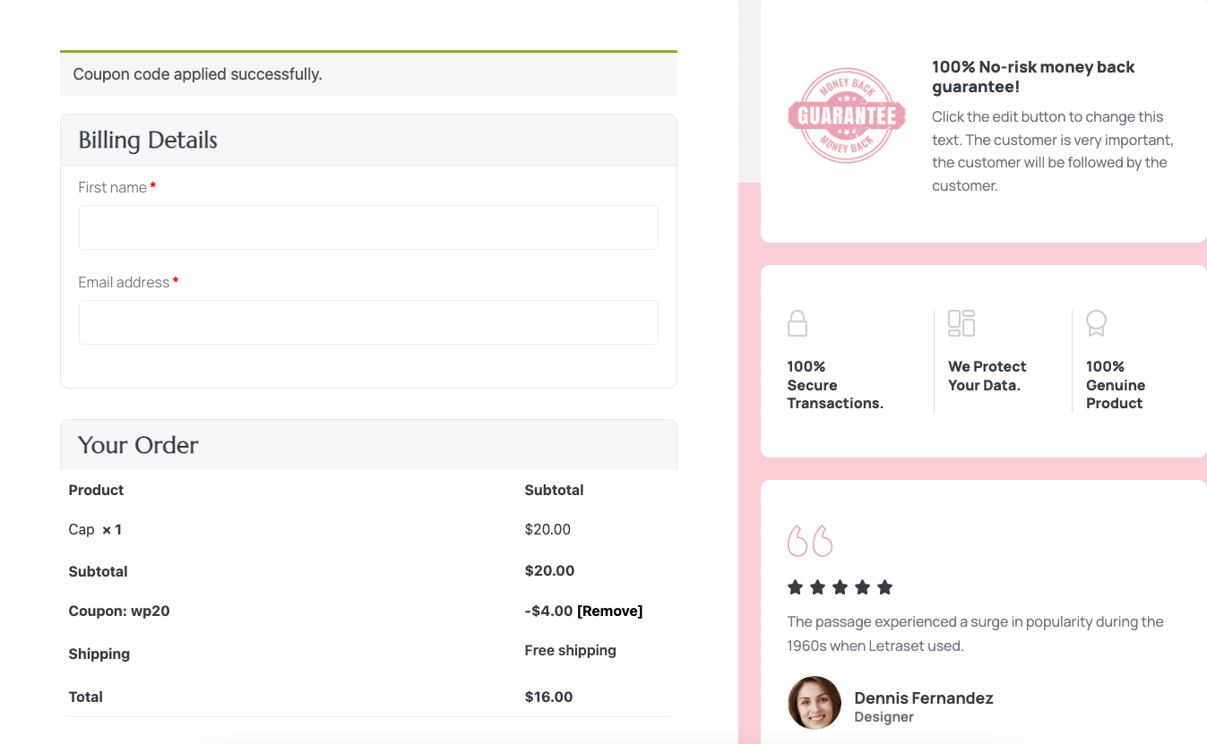
- Make the coupon section more highlighted
You may move the coupon section above the whole checkout form or place it just above the order summary. This will make it easy for the buyer to notice. You may even change the background color of the coupon option to make it more noticeable.
- Auto-apply the coupon on checkout
You may also set the coupon to be applied automatically. This will eliminate any confusion when applying coupons.
But this is not something you get with the default WooCommerce checkout settings. You will need to use a suitable plugin to get this down.
These optimizations will ensure people do not get annoyed when applying coupons, i.e., higher conversions.
5. Make Interesting One-click Offers On The Checkout Page
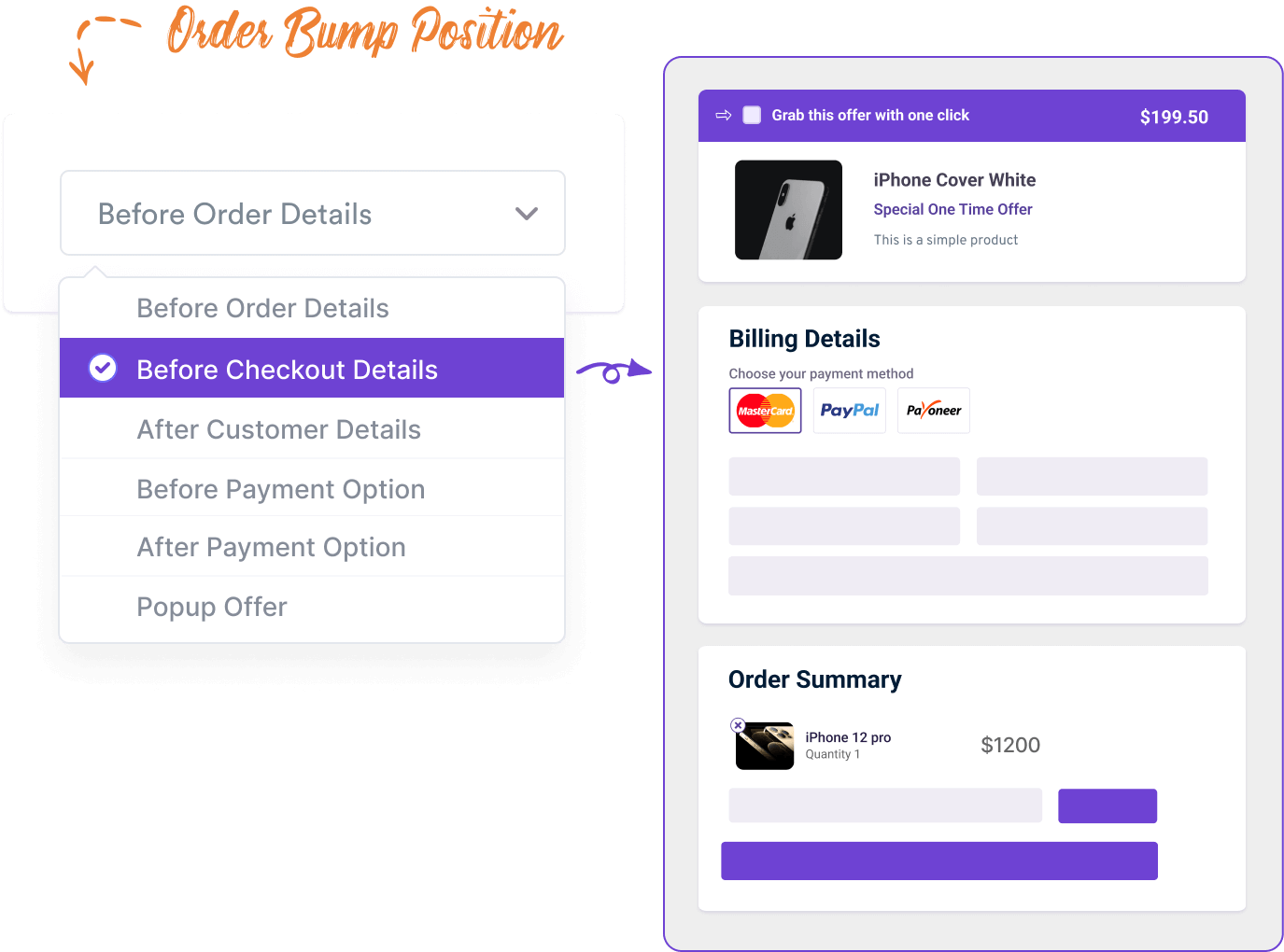
You could also make the buyer excited to complete the order by making a sudden one time offer on the checkout page.
For example, let’s say someone is buying a phone from your store. On the checkout page, you could offer him a phone cover at a good discounted price. This special discount will get the buyer excited as he may not get this discount later on.
While this is a good way to entice the buyer, you need to consider the previous advice of not creating more distractions.
Simply making an offer won’t do. You want this offer to get the buyer excited, not distracted.
- First, the product offered has to be relevant or demandable along with what is already being purchased.
As per the previous example, you offered a phone cover when the buyer was about to purchase a phone. This will be enticing because most buyers tend to look for a suitable phone cover right after they get a phone. So if this cover is attractive and the offer is good, the buyer will find this alluring. And with this excitement, he will look forward to placing the order even more.
But there’s more to this. You have to decide how you will place this offer on the checkout page.
- The position of the offer, the design, and the copy will play a big part, along with the discount amount.
So, where will you place it? How will you describe the offer? How will you offer it in a distraction-free way?
Here are some tips:
- Use a maximum of 1 line description.
- Include a clear image of the product.
- Offer a good discount that is more value for money and not available in the store.
- Mention the discount and the product name in the offer title.
- Place the offer in a position that will let him make decisions without losing the intention of paying.
The best place would be just above the order summary. - Avoid giving choices in this offer.
- Make sure the offer is relevant or a better alternative to what the buyer is about to purchase.
- The offer should be unannounced and not mentioned anywhere on the site.
If you follow these tips, your offer may turn out to be a great conversion trigger, while making you more money.
How To Apply These Unique Customizations To Your WooCommerce Checkout Page?
The five approaches you saw above are quite unique to what you can do in your traditional WooCommerce store. This means to apply these changes, you will either need to use custom codes or use plugins that allow making such changes.
The good news is there is a plugin that will allow you to implement all of these unique checkout page optimizations quite easily.
- WPFunnels
WPFunnels is the easiest sales funnel builder for WordPress & WooCommerce. Using this plugin, you will be able to set up sales funnels for your entire WooCommerce store to boost your sales.
And it has a special feature to allow you to replace your WooCommerce checkout page with a custom checkout page where you may implement all the unique ideas that you just learned above, plus more.
It’s quite simple.
- Get WPFunnels Pro
WPFunnels is the main plugin you will need to execute this.
- Install its Global Funnels Addon
It’s a special addon that allows you to create sales funnels for your existing WooCommerce store based on conditions and will allow you to replace your WooCommerce checkout page with a custom checkout page.
- Set up conditional funnels for your WooCommerce store to replace the traditional checkout page with a custom one.
You may choose to set this custom checkout page for specific products, categories, tags, or even the entire store.
- Customize the checkout pages and implement the unique optimizations you just learned.
– Enable quantity selection and auto-apply coupon options by configuring the checkout step.
– Use its checkout field editor to customize the form fields.
– Set up order bump offer for the checkout page with full control over design and content.
– You may design the page with your preferred page builder (Elementor, Divi, Oxygen, or Gutenberg).
– While designing the page, you will be able to place the form using a dedicated Checkout widget.
– Choose the checkout form layouts and the field designs from the widget settings.
And that’s it. You will have everything you need to ensure you have an optimized checkout process that will deliver a higher conversion rate.
Besides checkout customization, the plugin will also allow you to plan & craft sales funnels with dynamic upsells offers, custom discounts, and a complete funnel journey to increase your sales. So it’s a plugin that you would probably want for more than just creating a custom checkout page.
Final Thoughts
In conclusion, the key to maximizing WooCommerce conversions during checkout is to create a distraction-free checkout page and a simplified experience for your buyers. Plus, the added options of quantity selection, highlighted coupon section, and an enticing offer could help with triggering buyers to complete the orders.
So go ahead and create a WooCommerce custom checkout page that is optimized to reduce abandonment.
And start using WPFunnels along with its Global Funnels Addon to create an optimized custom checkout page that will surely deliver higher conversion for your WooCommerce store.
Cheers.


![How to Use One Click Upsell to Increase Revenue for Woocommece [2024] 24 One Click Upsell](https://getwpfunnels.com/wp-content/uploads/2024/09/One-Click-Upsell-.webp)
![Order Bump vs Upsell – What is Better to Increase AOV [2024] 29 Order Bump vs Upsell - What Works Better To Increase AOV](https://getwpfunnels.com/wp-content/uploads/2023/12/Order-Bump-vs-Upsell-What-Works-Better-To-Increase-AOV.webp)


![Guide To WooCommerce Funnels - The Global Funnels For WooCommerce [2024] 49 Guide to WooCommerce Funnels - Global Funnels](https://getwpfunnels.com/wp-content/uploads/2022/05/Guide-to-WooCommerce-Funnels-Global-Funnels-1.png)